Market Research: An Interview with Michael Mandiberg
By Tina Rivers Ryan
The 2008 recession drew attention to the destabilization of financial markets by a banking sector that skirts the edges of regulation, using purposely inscrutable financial instruments. In response, a number of artists have attempted to represent the social, political, and financial networks that comprise contemporary capitalism.
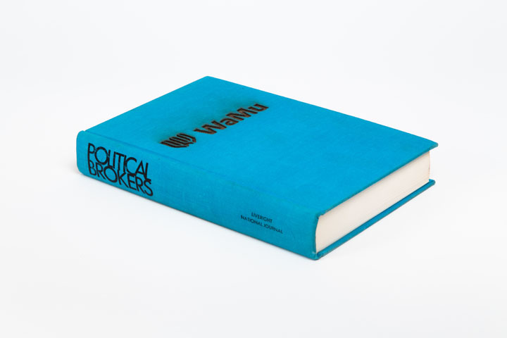
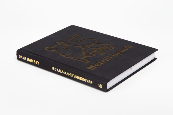
Around the time of the crisis, artist Michael Mandiberg began collecting discarded self-help financial books of the more optimistic recent past, along with the names and logos of failed banks shut down by the Federal Deposit Insurance Corporation (FDIC). He found the logos online, sometimes only hours before they were taken down as part of a restructuring or rebranding process. He then used a laser cutter to carve the logos in shallow relief on the covers of more than five hundred of the found books. (The artist has documented this process on video, and put an archive of the logos online.) Titled FDIC Insured, the installation will be on view from September 15 to December 15 in an empty office in New York’s Financial District, under the auspices of the Time Equities Inc.’s program Art-in-Buildings in collaboration with Denny Gallery.
TINA RIVERS RYAN I’m intrigued by your choice to present a list of failed banks with physical objects. The form of the installation, with its long rows of books, gives a visceral sense of the scale of the bank closures, and your use of a laser to cut the banks’ logos into the books insists that the crisis caused material damage. Can you discuss how you decided to work with books and laser-cutting?
MICHAEL MANDIBERG My use of financial guidebooks as readymades began on the street. As I walked around Brooklyn in 2008 or so, I noticed all the books that people were leaving on their stoops. They didn’t want them, but didn’t want to bother selling them, either. And yet people weren’t just recycling them: they still held some combination of sentimental value and use value that made them worth offering to passersby.
I was a senior fellow at Eyebeam at the time, and had access to a laser cutter, so I started experimenting with it. The laser cutter burns a perfect edge through the paper, leaving no visible trace of the human hand, but in fact the production process requires painstaking handicraft. I liked the laser’s precision and the fact that it worked by burning. I was burning books! Even if viewers don’t understand the role of the laser, they can smell the pungent odor and realize that the work was made by fire.
RYAN Your juxtaposition of the logos brings out similarities and differences, underscoring that these logos are very much designed, and that, like any aesthetic object, they can be analyzed to reveal how they produce meaning.
MANDIBERG Many of the logos are blue, which has associations with honesty because it symbolizes the purity of the heavens in Christian iconography. Lawyers encourage their clients to wear blue in the courtroom to present themselves as truthful. Blue was also a very expensive pigment in Renaissance paintings, used only for special paintings for wealthy patrons. There are some green logos, too—the color of dollars. Fonts tend to be conservative serif or generic sans-serif ones. Red never appears alone, only in patriotic combination with white and blue. Imagery refers mostly to the past, not to the future: Ionic columns from ancient Greece or troubling associations with the antebellum South. Many motifs convey a sense of place—countryside, the ocean, mountains. A few words come up again and again in the names, like “first”: First Bank, First National.
RYAN You don’t show just the names of banks. Your emphasis on the logos underscores the fact that these banks are not neutral or self-evident corporate bodies. Rather, they cohere into entities through their representation. The monotony of the logos is significant. It’s as if the banks can barely differentiate themselves, whether in terms of structure or surface image.
MANDIBERG Logos proliferated during the Industrial Revolution as a result of packaging, branding, and advertising. After World War II, corporations from the US and Western Europe began a global expansion aided by newly redesigned logos. Corporate design of the postwar period and beyond is timeless and legible in different languages and cultural contexts. Given the history of the logo as a transcultural marker of trust and stability, it is interesting that the FDIC erases the logos of banks when they lose their stability and trustworthiness. The archive of FDIC Insured is a memorial to these banks and the failure of their aesthetics of timelessness.
RYAN FDIC Insured shares several formal and theoretical characteristics with your project Print Wikipedia [2015], where you devised a script that downloaded the entirety of Wikipedia as it existed on April 7, 2015, organized it in alphabetical order as a print encyclopedia would be, and used the self-publishing service Lulu to print 106 volumes. In particular, I’m thinking of its serial production and display, its conceptual use of a system to generate content, and its concrete manifestation of online archives. How do you see the projects relating or diverging?
MANDIBERG As with Print Wikipedia, I am visualizing digital information by giving it a tangible form. We think of digital media as insubstantial and immaterial, but in fact it’s quite material and unstable. I started the two projects within a year of each other, and both took about six years to complete. Both tread a fine line between utility and uselessness. Print Wikipedia is always already out of date, but each book is a real book with actual entries. By contrast, the books in FDIC Insured are physically ravaged.
RYAN Occupy Wall Street helped keep the conditions that caused the 2008 financial crisis in the national spotlight. Do you see your work as connected to that movement?
MANDIBERG FDIC Insured is political, but I don’t see it as an activist work. I see it as a contribution to the collective memory. The system tries to ignore its failure and get on with things, but we haven’t been able to move on—the economy keeps getting worse for the ninety-nine percent. The books are suggestions of how the world could be otherwise, because they speak to the impermanence of the system, offering a reminder that it can fail and end. There’s also something poetic about these banks being cast off by the FDIC, like books and dreams are cast off by people.
RYAN Site-specific installations often draw impact from proximity to the object of their critique. With that in mind, what can you say about the location of the next installation of FDIC Insured?
MANDIBERG I really felt that it had to be shown in New York. I thought it was symbolically important to exhibit it in the area where the problem started, and specifically in a recently vacated office. In the period immediately after the meltdown, there was a huge increase in vacancy rates across the country. “Space Available” signs visually marked the crisis. So being in a space like that sets the tone. I also think the project could do well in a foreclosed house in the suburbs. Maybe that’s where it will go next.